The Lie Factor vs. the Baseline Principle
What’s your argument? For researchers, the answer to the question often comes down to: What do the data say?
That question, however, implies that researchers just spit out the answer. No: You decide the answer, in three critical ways:
We speak for the data, which means we invariably frame the data (and have to take responsibility for that framing).
We are always speaking to someone — a particular community or communities for whom the data might have different impacts.
There are data and there is change in the data— and that the latter is what your argument is usually all about. Through one end of the telescope, the change might look minuscule; through the other, vast.
A better question might be: Is your argument in proportion to the impact of the change in the data you’re observing on the audiences you’re speaking with? Are you exaggerating that impact? Damping it down?
This tension plays out again and again in data visualization, in a tug-of-war the data visualizer Hilje de Boer calls the Lie Factor vs. the Baseline Principle. Both phrases represent principles of Edward Tufte, the famous data visualizer. Here’s Tufte’s definition of the Lie Factor:
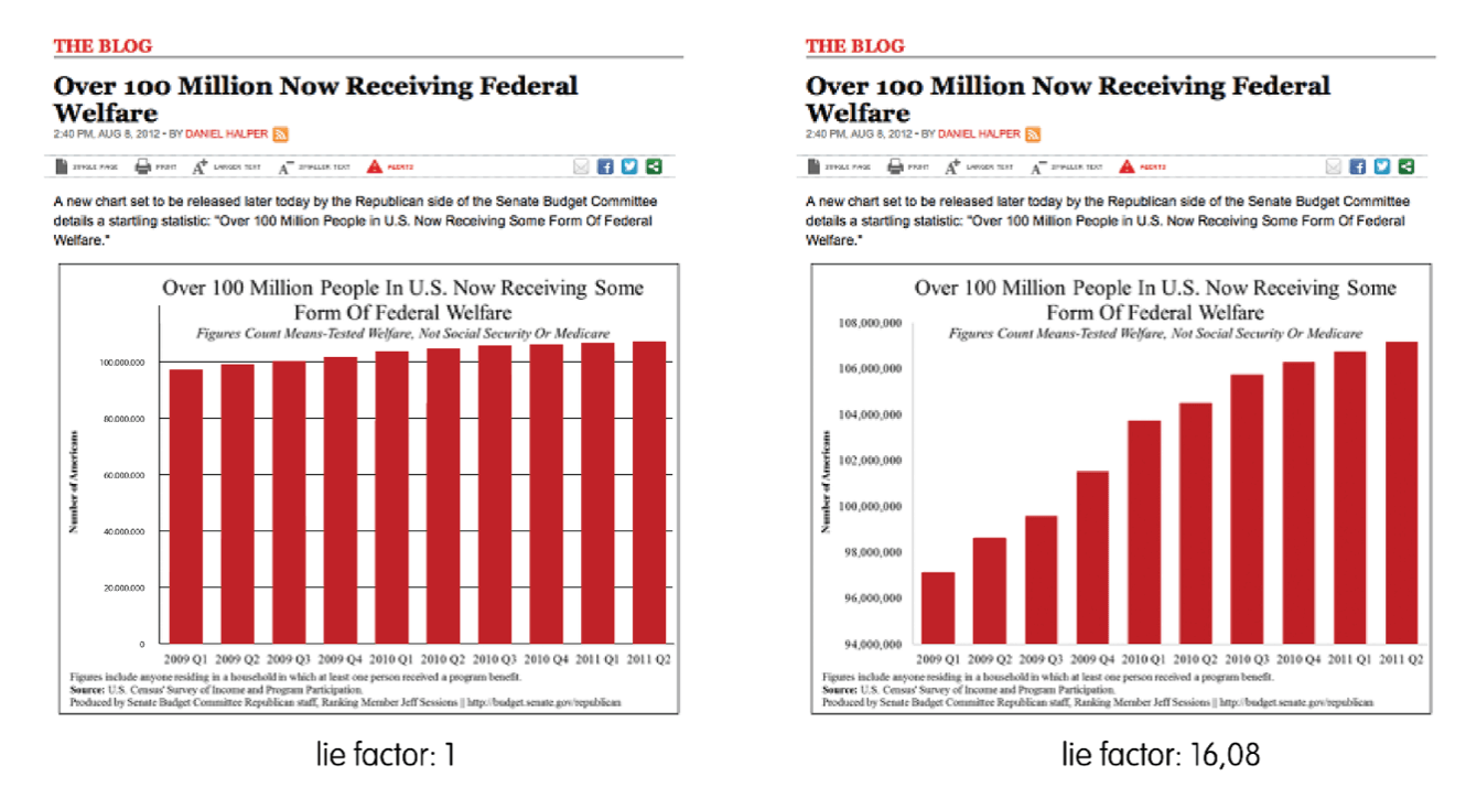
As de Boer notes, a “best practice” Lie Factor is around 1 — i.e., there should be no difference between what the visualization is telling you the size of the effect is and what it actually is in the data. To illustrate different Lie Factors from the same dataset, De Boer shows two versions of the same chart from USA Today, both depicting increases in the number of US residents receiving welfare between 2009-2011:
A common way of exaggerating effect in the visual (and thus amping up the Lie Factor) is to truncate the y-axis, as in the chart on the right, which has a Lie Factor of 16.08. The chart on the left (with a y-axis starting at 0) has a Lie Factor of 1. Based on these charts, we might conclude that the chart on the right is dramatically exaggerating the increase in received welfare over this period.
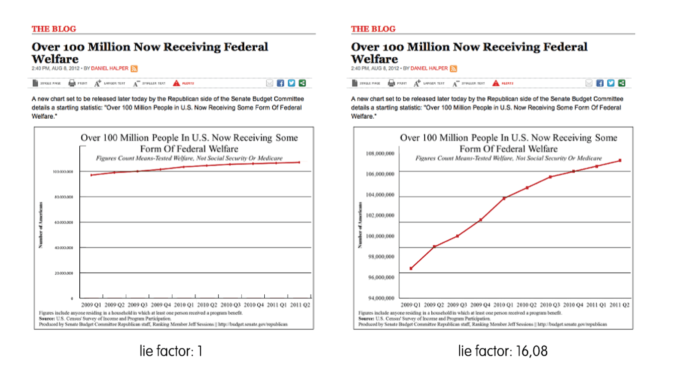
But when we look at the same charts as line graphs instead of bar charts, as de Boer puts it, “the Lie Factor is the same, but somehow the corrected version on the left seems a bit off” — I.e., it is minimizing any sense of change, which is also deceptive:
There is a relevant data change to depict, says de Boer — but bringing your Lie Factor down to 1 doesn’t allow you to visualize it.
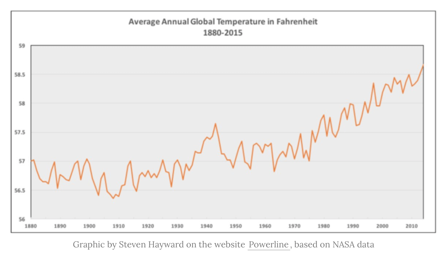
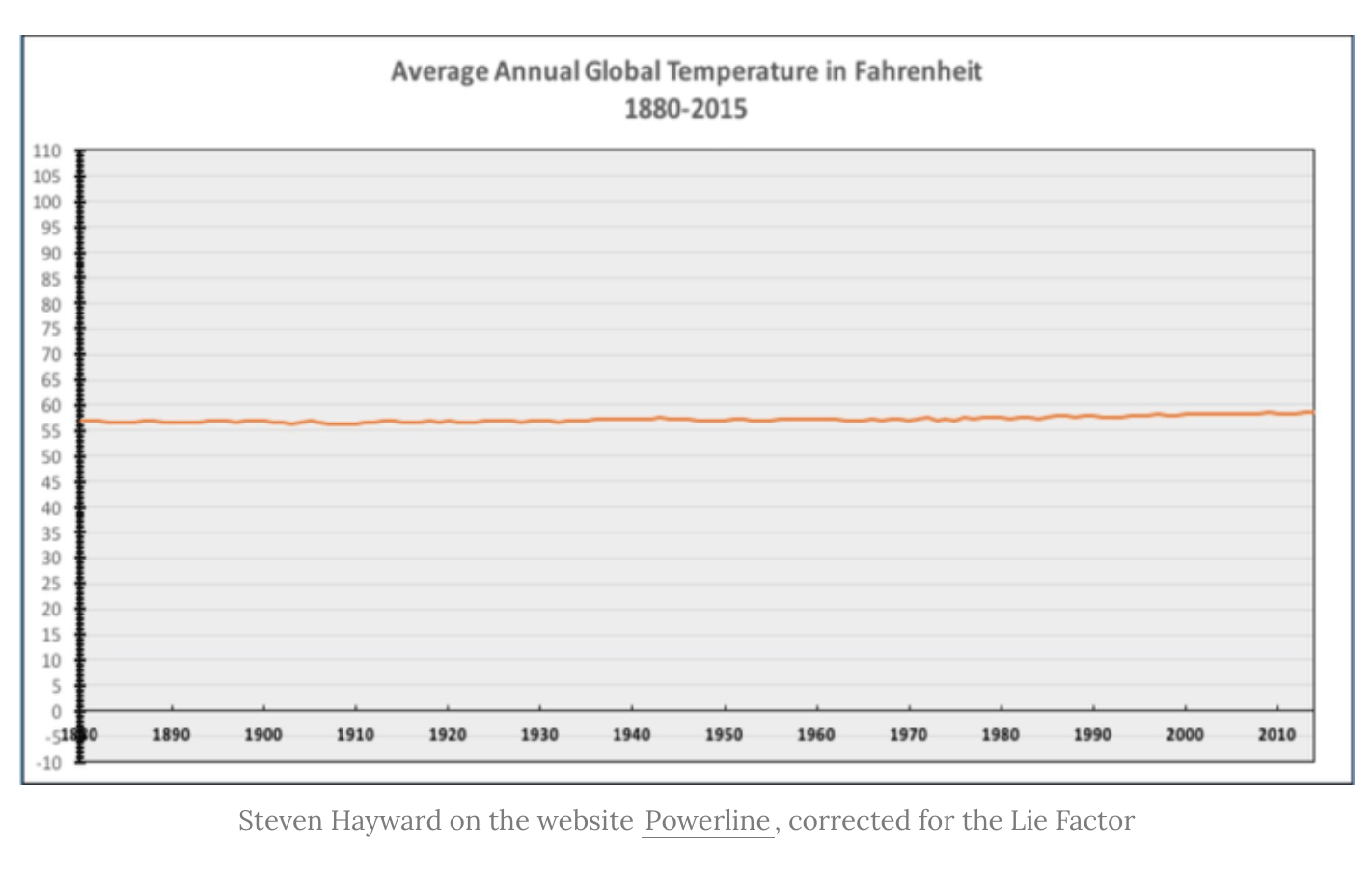
Tufte recognized this omission and gave us a concept de Boer calls The Baseline Principle — as Tufte put it, “use a baseline that shows the data, not the zero point. …don’t spend a lot of empty vertical space trying to reach down to the zero point at the cost of hiding what is going on in the data line itself.” Case in point: Two graphics showing average annual global temperature from 1880-2015:
The top chart has a Lie Factor of 110.14, says de Boer, while the bottom one has a lie-factor of 0.65. Climate changer denier Steven Hayward used these charts to argue that global warming is a hoax. As de Boer notes, Hayward is following to the letter the Lie Factor — a rule designed to minimize manipulation of the y-axis with intent to mislead — in order to mislead us that there has been no relevant global temperature change in the last 130 years.
De Boer’s takeaway: The only rule data visualizers should follow to the letter all the time is “to tell the stories that are in the data, show them in context, and engage our audiences.”
Of course, that’s also the job of researchers who inhabit the role of public experts, too — all three parts of that rule. But our bias as researchers and public experts is to maximize context and minimize story/narrative and engagement. Maximize caveats, minimize relevance.
Is this change in your data a relevant enough story to your audience? That depends on the change and your audience. But you have to be willing to tell the story first. You have to be willing to make that difference.
The difference between public experts and other experts: When faced with the choice between a) telling the data-based story that could help a community and b) avoiding a lie factor at all costs, public experts choose a).


